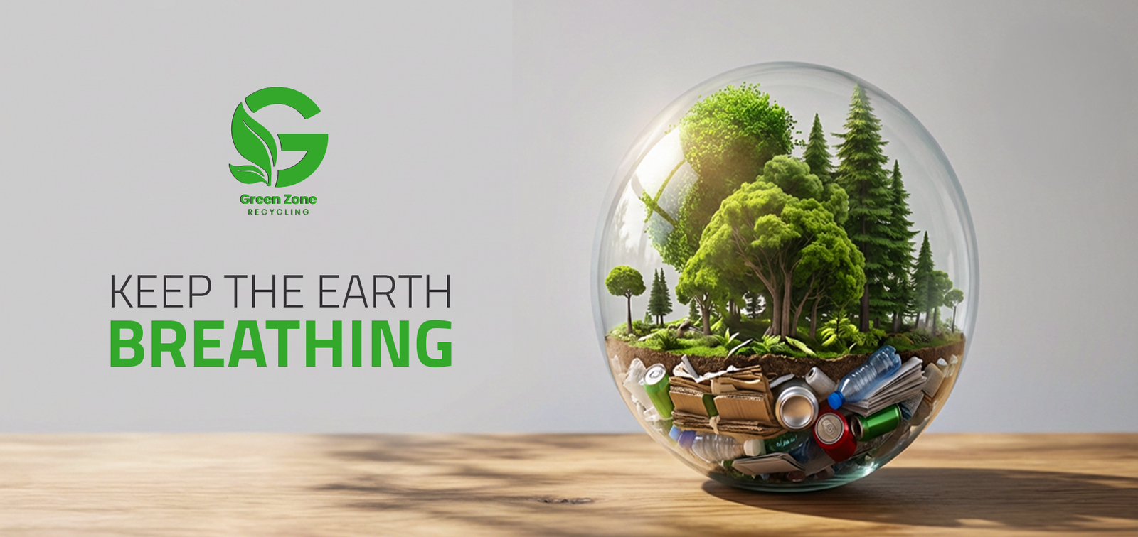
Our purpose is to help brands grow with confidence, and impact in an ever-evolving digital world. We believe great design is more than aesthetics—it is a powerful tool for solving problems perception meaningful.
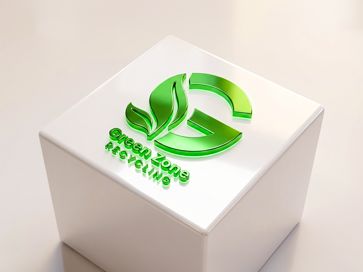
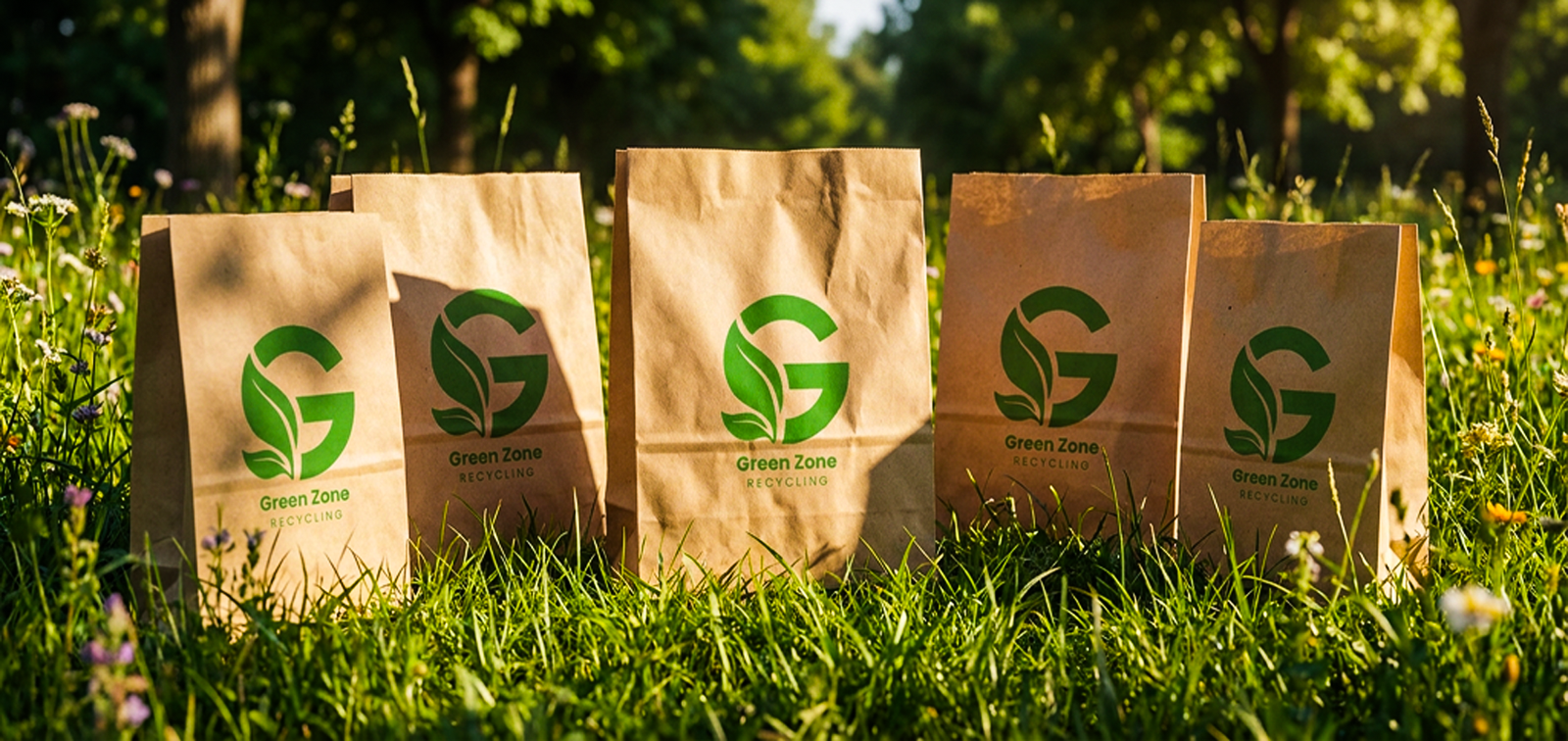
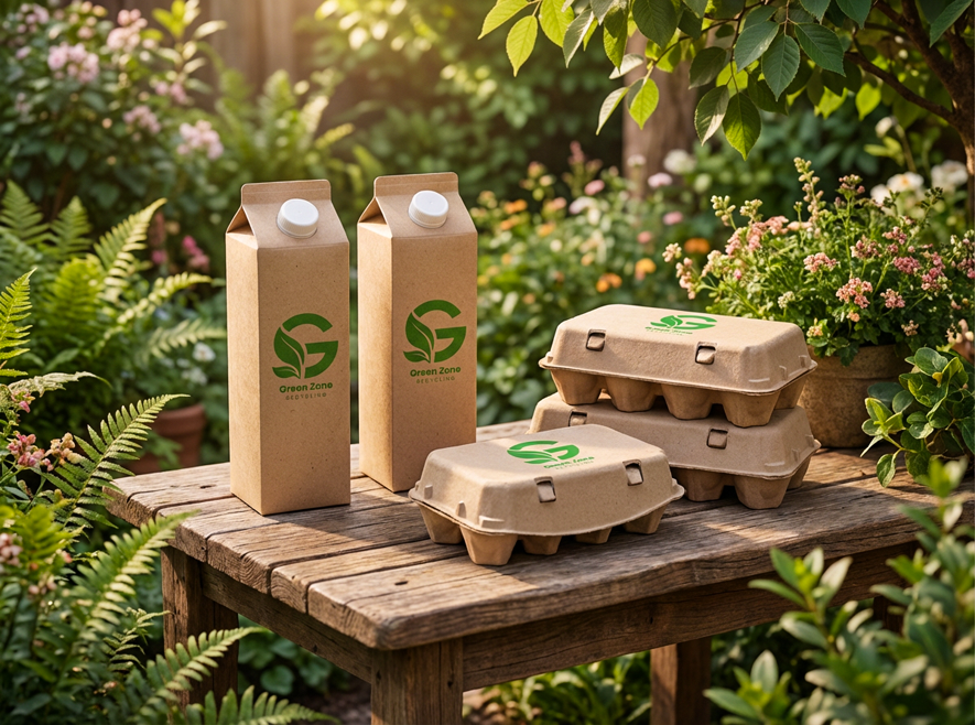
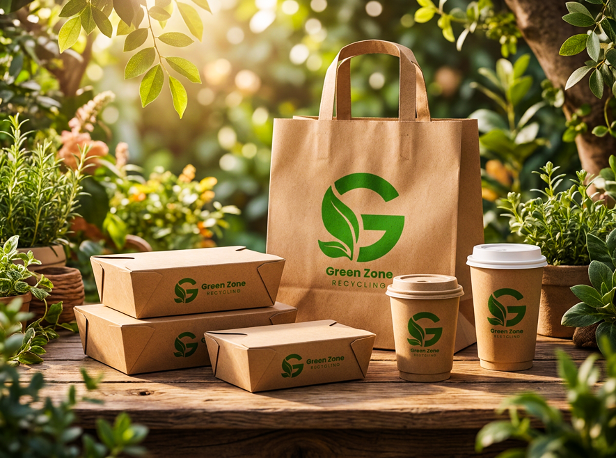
The icon is built around the letter “G”,
integrated with a leaf shape to symbolize
nature, sustainability, and recycling.
This combination reinforces the brand’s
environmental focus in a simple and
recognizable form.
The color palette consists of light green,
white, black, and dark gray.
Light green represents growth and
environmental responsibility, white adds
clarity, black provides contrast, and dark
gray supports a balanced and professional
visual system.
The logo uses Poppins, a clean and modern
typeface that ensures clarity and readability
while reflecting a contemporary and
professional brand character.
©2026 Triangle Studios. all right reserved.