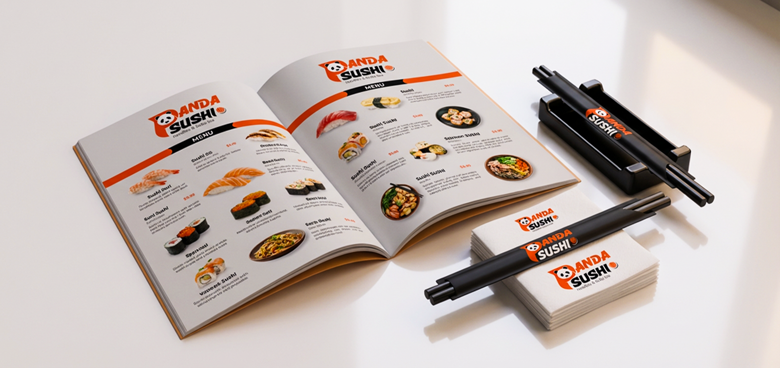

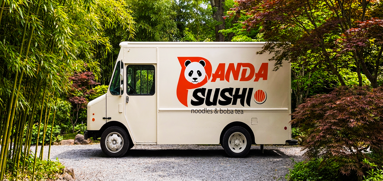
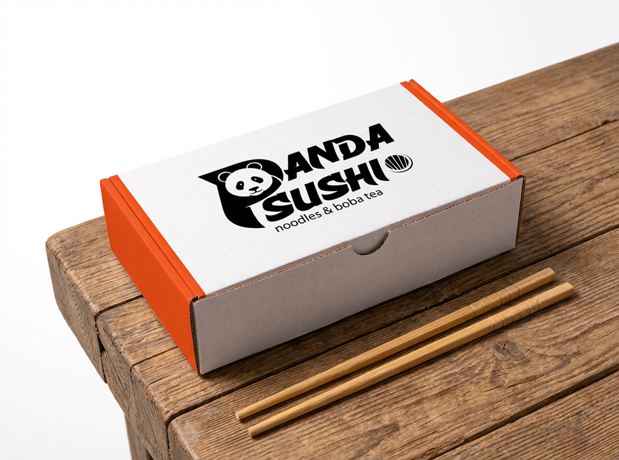
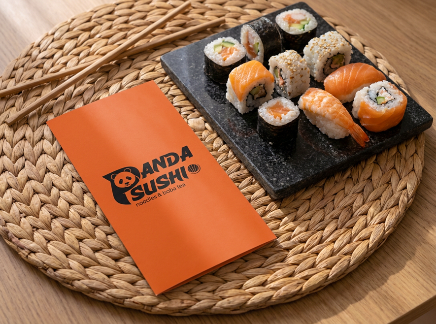
Panda Sushi
Our purpose is to help brands grow with confidence, and impact in an ever-evolving digital world. We believe great design is more than aesthetics—it is a powerful tool for solving problems perception meaningful.
- [ Designer ] Team Aok Leads
- [ Categories ] Branding
- [ Year ] 2025
- [ Client ] Panda Sushi
- [ Status ] Completed
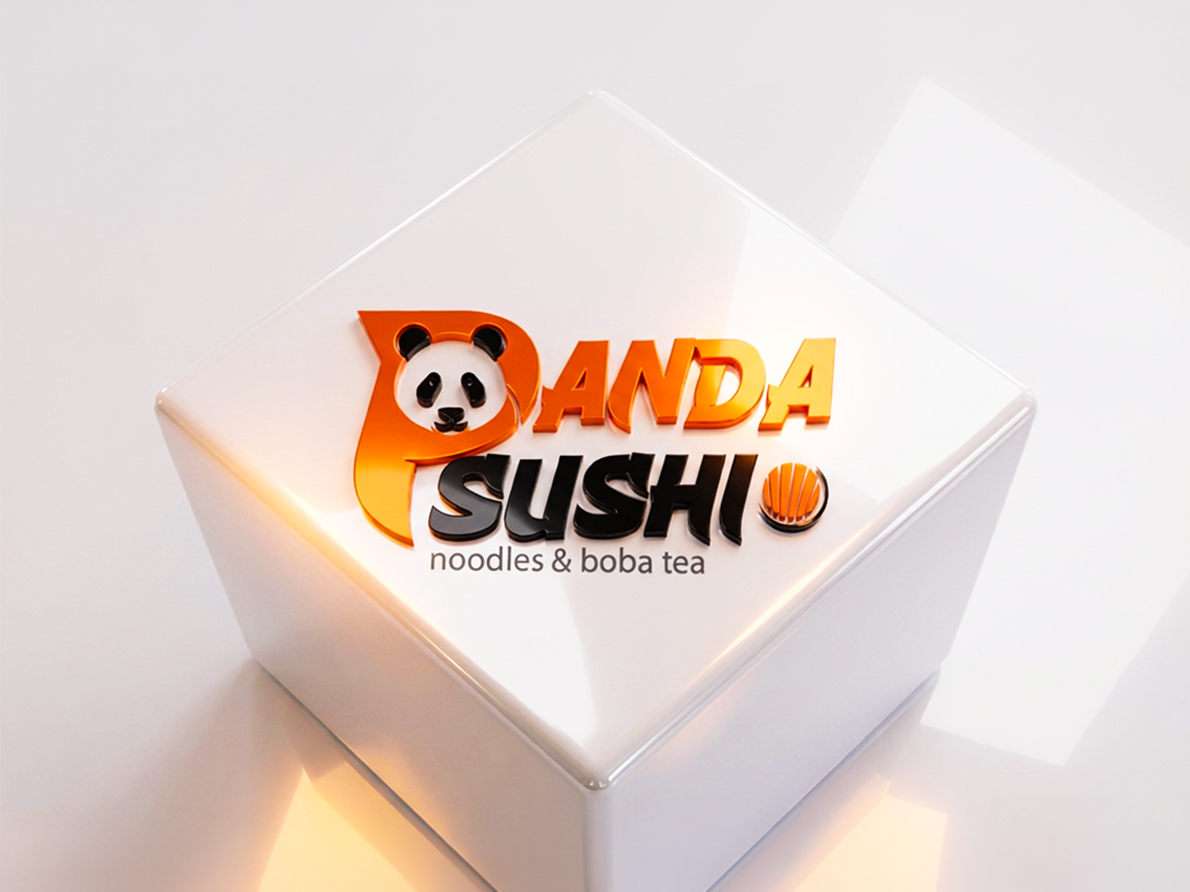
Icon
The icon creatively transforms the letter “P”
into a panda shape, merging the brand’s
mascot with the initial letter.
This clever design makes the logo instantly
recognizable, playful, and memorable,
reflecting the friendly and approachable
personality of Panda Sushi.
Colors
Salmon Orange – The primary brand color,
vibrant and warm, evokes appetite, energy,
and friendliness. Perfect for highlighting key
elements and creating a memorable
presence.
Black – Used for the panda icon and primary
text, adding contrast, sophistication, and
legibility across all applications.
Dark Gray – A supporting neutral tone, ideal
for secondary text, backgrounds, and subtle
elements, ensuring balance without
overpowering the primary colors.
Typography
Mosscave – Rounded and friendly, perfectly
matching the playful panda icon. Modern,
approachable, and readable across all
media.
Co Headline – Strong, clean, and geometric,
ideal for headings. Provides clarity and
impact while complementing Mosscave for
a balanced typographic system.